Objective
Flexshares

Over 6 weeks: FlexShares came to us for a complete redesign of their financial services website. The website was in need of a visual upgrade, improvements in navigation and flow, and better content layout.
Project Details
MY ROLE
Experience Designer
TEAMMATES
• 1 Visual Designer
• 1 Information Architect
TIMEFRAME
February 2022 - April 2022
TOOLS & METHODS
Figma, Competitive Analysis, Wireframing, High-fidelity Mockups, Prototyping
Our Given Problem
FlexShares is a financial services company that offers Exchange Traded Funds strategies that seek to help investors achieve their goals. They provide products and solutions allowing advisors to create and manage outcome-oriented portfolios.
My team at Publicis Sapient was tasked with doing a complete website redesign. There were many improvements to be made in a variety of areas. A large effort was put into improving the visual look and feel of the website. Other areas of improvement included restructuring some of the content layout and navigation flow throughout the website in order to make it more appealing and easy to understand.
Project Overview
• Competitive Audit + Inspiration
• Wireframing
• Mockups
• Prototyping
• Client Review
Competitive Analysis
As one of our first steps, the design team needed to understand our users and their competitors. We facilitated sessions in which we would pull insights from competitors and discuss them as a group to determine what direction we wanted our design to go in. This allowed us to narrow down the useful and valuable features for FlexShares users based off of what competitors included in their websites.
Pictured above are few of the many competitors our team analyzed. We were specifically looking at navigation flow and placement of visual elements and information. Some of our takeaways were:
• Visual elements such as charts and infographics need to correctly communicate the information they contain rather than just being there for the sake of being there
• Navigation flow needed to be simple and easy to follow rather than a detailed menu that could lead to information overload
Wireframing
As a team of three designers, we truly emphasized collaboration and discussion. After taking in the insights we learned from competitors, each of us chose different areas of the FlexShares website to begin our wireframes and designs. We would have daily discussions on different concepts and ideas and would often build off of each others screens or offer other solutions when needed.
This process involved taking the current screens from the FlexShares website, breaking them down to simpler components and parts, and starting to play with different layouts for the blocks of information we needed to include. I extensively worked on the wireframes and screens that had to do with the “Fund Details” page. This phase of the project was highly iterative and involved a large amount of discussion and even review with the clients. After this review, we had narrowed down hundreds of screens to the most ideal flow and layout to continue with for high-fidelity mockups.

Wireframe Review


In our wireframe review, our team walked through many different versions and concepts with the clients. We went over multiple options of the same page with different ways of laying out the information and defended why each worked, taking into account the clients’ reactions and thoughts. We narrowed down our direction even more with the client feedback we received from this review and continued to develop our screens even more.
Iteration

High Fidelity Mockups
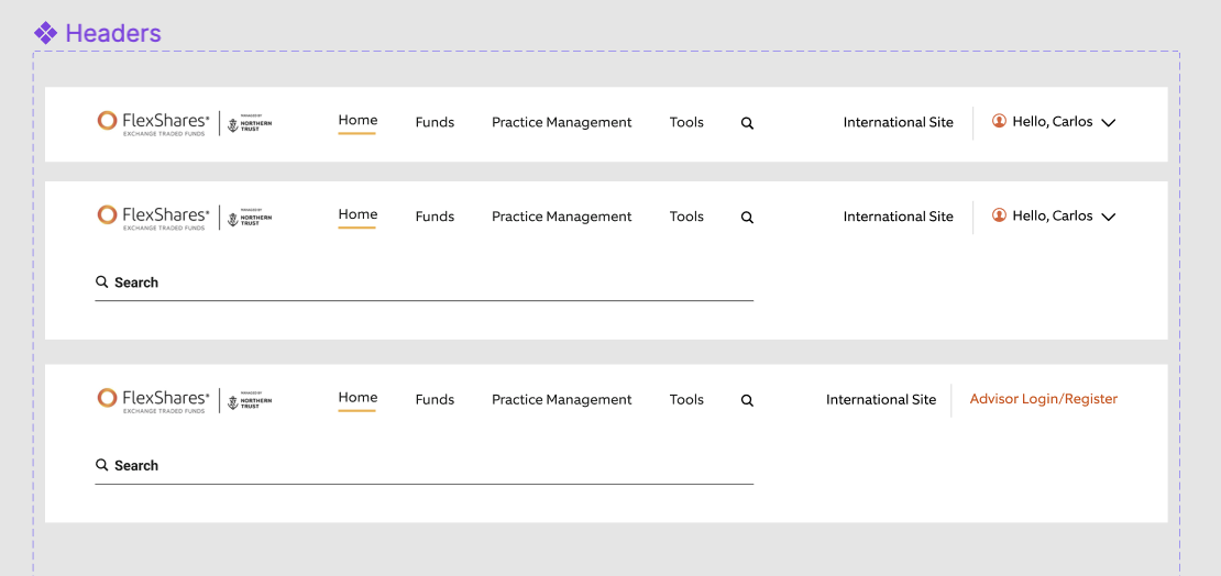
Using Figma, our team then worked on bringing our wireframes to life. In this phase of the project, I really leapt into the different features and abilities that Figma offers such as components, variants, and auto-layout. The clients provided us with brand guidelines as our only real source for visual design. Using those guidelines along with mapping out the reusable pieces that we saw present on multiple pages of the website, we started to put together a design system. I worked largely on the navigation aspect of this design system, creating components and variants that would then be used to piece together the navigation bar. We created a set of typography styles as well as kept our screens aligned to a grid to ensure that our designs were consistent.


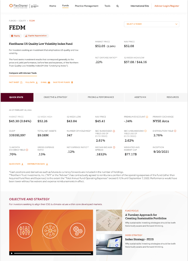
Before and after our visual redesign of a fund detail page
The following are a few examples of items that I created components for in Figma to be added to our growing design system. These were created with atomic design in mind – oftentimes one component would consist of other smaller components to make up a larger block of information. These pieces of information were used in multiple places on the website, increasing our consistency and ease of creating new screens.


Prototyping and Presenting
As we closed out this project, our team wanted to ensure that we handed off our design deliverable in a cohesive and understandable way. To do this, we prototyped out some of the interactions that would be present in the implementation of this website redesign. I created the navigation bar interactions, connecting each option in the navigation header to the appropriate page. I also worked on a simplified prototype of the general flow through the website. We showed our final product to the client and received a lot of positive feedback. The clients received our redesigns well and all agreed that we had significantly made a lot of improvements in the area we were looking for.
Takeaways
I gained a great deal of UX design skills on this project. I was able to contribute to a design system through creating and adding my own components. I also appreciated the liberty and independence to develop wireframes and turn them into designs on my own. As we went along with the desktop screens, I also turned them into mobile screens, learning to adjust the layout and design to fit and work as a mobile version. I also was able to do a good bit of prototyping, specifically through the navigation bar interactions for both desktop and mobile versions.
At the end of this 6-week project, my team handed off our design screens and prototypes to the developers that would then go on into the implementation phase. This implementation has now been launched and visible on flexshares.com.